


An OKR dashboard should help teams understand progress against objectives and key results, but it should also help leadership see what is driving that progress. A dashboard that only shows percentages can miss the real operating questions: who owns the work, what changed, what is at risk, and what needs attention.
Elate supports OKRs, but it is broader than OKR tracking. Elate helps leadership teams connect goals, initiatives, owners, KPIs, risks, updates, and executive-ready reports in a repeatable strategy execution rhythm.
What an OKR dashboard should include
- Objectives and key results.
- Current progress and confidence level.
- Owner for each objective or key result.
- Initiatives or workstreams tied to the OKR.
- Risks, blockers, or dependencies.
- Latest update explaining what changed.
- Review date and next action.
- Rollup view for leadership.
Where OKR dashboards fall short
OKR dashboards can be useful for alignment, but they do not always capture the full strategy execution story. Leaders often need to see initiatives, risks, resources, ownership, and reporting context alongside OKR progress.
If OKRs live separately from operating reviews, the dashboard can become another place to check status rather than a system that helps leaders make decisions.
How to make OKR reviews more useful
- Keep objectives connected to strategic priorities.
- Assign clear ownership for every key result.
- Use narrative updates to explain changes in confidence.
- Connect at-risk OKRs to blockers and leadership asks.
- Review progress on a consistent cadence.
- Use the dashboard to guide decisions, not just report scores.
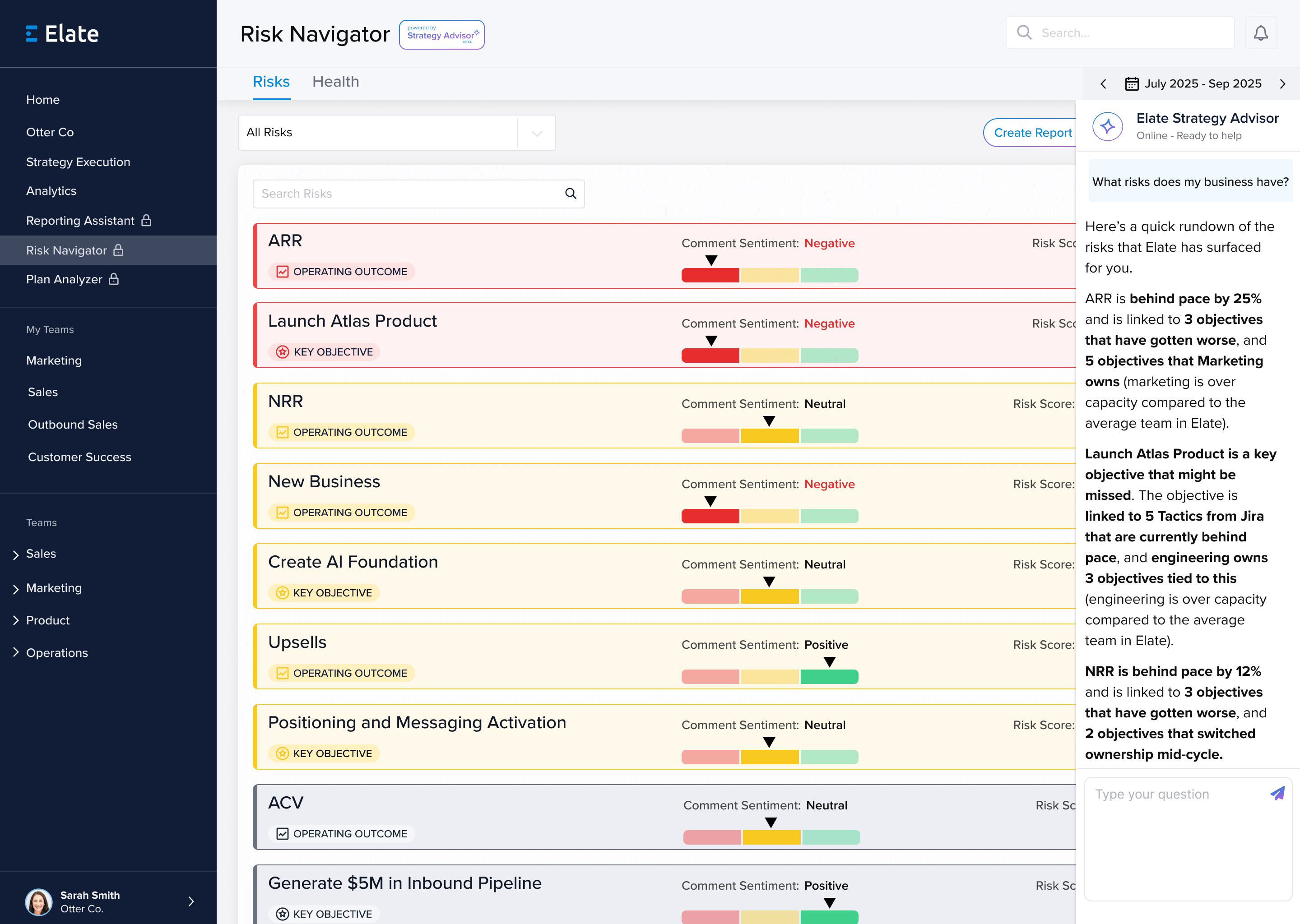
How Elate supports this workflow
Elate is a strong fit when OKRs are part of a broader strategy execution process. Teams use Elate to connect OKRs to initiatives, owners, risks, KPI context, updates, and executive-ready reports.
Elate is not only an OKR tracker. It works best for organizations that need goals, strategic initiatives, and leadership reporting connected in one operating rhythm.
Related resources
- Strategy execution software
- Strategic planning and execution software
- Company scorecard
- Elate platform
- See Elate in action
FAQ
What should an OKR dashboard include?
An OKR dashboard should include objectives, key results, progress, confidence, owners, related initiatives, risks, updates, and review cadence.
Is Elate an OKR dashboard?
Elate can support OKRs, but it is broader than an OKR dashboard. It helps teams connect OKRs to strategy execution, ownership, risks, and executive reporting.
When are OKRs not enough?
OKRs are not enough when leaders also need to manage initiatives, risks, dependencies, narrative updates, and board or executive reporting.